Monday, May 9, 2011

Ceilings- the Mural Painter's Claim to Fame


~~~~~~~~~~~~~~~ * ~~~~~~~~~~~~~~~

Go almost anywhere in Europe and you have to look up to the ceilings. That's where much of the great ceiling art is located. These frescoes are a wonder and we're all amazed. Often you will hear, "how'd they do it!?" Truth is, the tourist visitors probably have more of a sore neck than Michelangelo got painting his ceilings. One does not lie on one's back. You install a scaffold and stand. Your shoulder becomes sore before your neck.


Now it is true the ceiling is quite challenging, and for many, daunting. Ah, but it's certainly fun, and the results are always worth the effort.


Ceilings are most generally flat, though recently I was commissioned to paint a concave ceiling. We will discuss concave ceilings another time. This edition we're talking about flat ceilings, pricing and pounce patterns. Good stuff!


*************************************


In this edition of mural painting I want to start with a simple design motif versus a detailed scene. I hope here to help you with design, layout and application considerations.
Items you will need-

* An overhead projector
* A pounce wheel set
* Black chalk (artists chalk sticks)
* A roll or two of banner paper
* Blue 3M painter's tape
* A large cardboard box (you're going to cut this up)
* Assorted acrylic paints
* An assortment of acrylic paint brushes
* A bag of rags
* One quart of acrylic (water based) clear coat.
* A quality low nap roller, roller cage and paint tray
* One old (but no holes) sock
* One good helper


~~~~~~~~~~~~~~~~ * ~~~~~~~~~~~~~~~~~
I am going to use one of my simple entry-way ceilings as our example. The image (below) shows the ceiling project space. It is a fairly small, typical size: 6 feet wide by 12 feet long.


~~~~~~~~~~~~~~~~ * ~~~~~~~~~~~~~~~~

First step is to get a very accurate measurement of the ceiling.
Next: Talk with the client about design expectations: Simple, ornate, Old World style or maybe something more modern/contemporary. Take into your considerations the home decor together with architectural elements of the home. A really good place to find a design motif is to check out the furniture, i.e., accessories like hutches and curios that incorporate wrought iron.


In this case the style was decidedly Old World with a touch of modern. I took my measurements, and in looking around the client and found a design element on a curio cabinet. I took a quick picture. I headed back to my studio and set to work on my work-up. Always draw up your design and make it to proportion, e.g., 1 inch equals 1 foot for example.


Next: Have the client look over your work-up and tweak it as necessary. This is where the pricing comes in. I charge by the square foot. Prices for ceiling art is more than what one charges for wall art. Simply stated, it's harder, more time consuming as you have to get way up on a ladder or scaffold. Sometimes you have to rent scaffold if it's a big job. All of these factors are just labor considerations for these projects. So a wall of the same size might run (according to detail involved) from $8 a square foot while the ceiling will run $14 for example. Typically you're looking at a two, maybe three day job. One to draw it up (min 2 hours) then get an approval (maybe another hour travel time and all). One day to make the patterns up (shooting the pictures, copying to transparency, cutting border paper and pouncing the design (min 3 hours). And one day to apply/paint it on the ceiling (min 4 hours). So you have a good 8 to 10 or more hours in this. One hundred an hour is reasonable, and when writing the proposal in square foot lingo, should be from $14 to $16 per square foot. This covers and includes all materials and labor for this job-- more if you have a larger, and much higher ceiling. In such a case you factor in scaffold rental and height. I charge scaffold rental at the price I rent it and add .50 cents for every foot over 9 feet.


Note: What I like to do is draw out my design small enough that I can either scan it in my computer or shoot a digital picture and upload it to MyPictures. From that you're going to place a transparency into the printer and copy your drawing onto the transparency.
Next: You should have obtained from Office Depot or Staples or even a school supply store, a roll of banner paper.


Next: Find a wall space large enough to roll that banner paper out and where it is easy enough to draw on.


In our example my design was made such that the design featured a central design around the existing light fixture (see picture below). As for the four sides I made up a different design to form a boarder of sorts.


Thinking along these lines of my design what I did was pulled out a length of boarder paper to cover the whole length (12 feet). Then another length of boarder paper for the short side.
Next: Take your transparency of the design and place it on the overhead and simply shoot it on the boarder paper. Take measurements to be sure the design is sized to what your ceiling dimensions actually are. You don't want it short so that you have to fudge it when on the ceiling.
Next: Just trace the image onto the boarder paper. Do the same for the center design.
Next: Cut up your cardboard box so that you can lay it out flat on the wall UNDERNEATH the boarder paper. You will need to tape the box onto the wall. The box will protect the wall from the pouncing and help make the pouncing much easier.


Next: Get out the medium or large pounce wheel (image of pounce wheel below).

Begin tracing the designs. Be careful not to push to hard as the pounce wheel is sharp and can easily turn the paper into a stencil. You do not want a stencil, you just want the nice little holes and the design all intact on your paper. Once you have pounced the design remove the paper and on a harder surface, like the tile floor, concrete garage floor is good, very lightly sand the patter on the back side. This removes the chads so that when you pounce it, the chalk won't clog the holes.


Next: Get one of those rags, lay it out flat and get several large stick of your artists charcoal out and roll them up in the middle of your rag. Get a hammer and lightly pulverize the chalk to powder. Now pour that into your old sock. You should have at least a golf ball sized amount. Tape off the top of the sock so it doesn't fall out. If the sock is very thin, you might need another. You want to be able to pounce it on the patter but not have it go flying all over the place.
Now get your helper and take the design to the space, lay down drop cloths to cover the floor area so as to capture any chalk dust. Set up your scaffold or even a couple of ladders with a good sturdy 2" x 10"x 8' board (which is all I needed for this project).


Next: You and your helper take your Blue 3M painter's tape and rip off several pieces about two inches long and stick them on your apron all about your chest. Now place the long side pattern onto the ceiling, end to end and against the side and apply the tape so it stay in place. You will need to work quickly as the tape will soon come loose from the paper. Take your pounce bag of black chalk and lightly pounce the perforated design in an up blot, blot fashion. You do not want a lot of chalk flying but you need enough to transfer through the holes. A quick check on the side will let you know it you're tamping the bag hard enough. Trust me, it takes very little blotting force.


Once done, wipe it off outside, flip it over and go to the opposite side and do it again. Now you have exact matching images on both long ends. Do the same for the short side.
Once the sides are done lay up the center pattern. You might need to cut it in half to go around the light fixture's button. That is what I did in our example. It's easy enough. Okay, not let's paint!


Basically, painting it is simply filling the pattern you pounced. If you were good at keeping inside the lines with your coloring book as a kid, well you'll have no troubles then. Now collect your check and get ready for another great mural project.


Remember, if you're not having fun, you're not doing it right!
Until next time.

MuralMan

Saturday, May 16, 2009

MURAL ART - THINKING OUTSIDE THE BOX

I love a challenge, don't you? I mean anybody can hang up a painting in a space, or fill it with wrought iron filigree, pots or plants.... but not everyone sees a space like a mural artist. For me, every wall, every ceiling, is a canvas - wasted space that needs a little sumpin', sumpin'. Ya feel me?

I came into this project (a lovely home in south Tulsa), not knowing what to expect. The client was very savvy when it comes to decor, and her tastes in furnishings, impeccable. Initially the client was looking to have a little trompe l'oil brick painted here and there throughout the house. I am always a little dubious about this treatment because it does not always work. That is, it doesn't always flow with the home's architecture or decor. Such was the case with this home, for it had that sophistication about it. It really was not suited for painting that ancient crumbling plaster look, though it definitely has that Old World appeal about it, just not "that old," if you know what I mean. What my eyes saw though was something the client never thought of looking at as a way to infuse mural art. There on the south wall in a large room was this massive, fantastic hand carved faux fireplace. Now imagine - the walls are nearly 10 feet and this faux fireplace was 8 feet tall and about 6 1/2 feet wide! It had a very large faux hearth opening, 4 feet x 5 feet. In front of it was one of those typical painted fireplace screens. Oh it looked alright, but man what a waste of space is what I thought.

Well the long and short of it is this: When the client told me she wanted some trompe l'oeil bricks painted here and there throughout the place I said, "No, you don't want that." She looked at me like... "Huh" and said, "Well yeah, I think I do. Or what do you see for this space?" Man, I love it when people give the artist some respect! You know we all have our gifts and callings, but we are not always able to see everything worth considering. So for me, it truly is refreshing when a client can rely on me to give a suggestion and not feel threatened or intimidated. My number one priority is to please my customer... but not at the sake of reputation or the quest for fast cash.

I explained that I felt the rustic, exposed brick idea, in my opinion, did not really go with her home's architecture and decor. My wife suggested a faux finish on the walls to give it that warmth she hoped to attain by adding the trompe l'oeil exposed brick. I then suggested she let me create some custom Old World charm by painting a series of murals for her beautiful faux fireplace hearth. She was not even considering this as an option, but here again, a client that feels confident in you, will place trust in your ability as well. Such was the case here and once the walls were faux finished and the stark white base and crown molding were glazed, the client, knowing what she wanted, asked me to paint one section of exposed brick....what!!!????

Well we all had a laugh as I laid out a corner and painted my best trompe l'oeil exposed brick. The client had left the home to run some errands and when she walked in she took one look at the exposed brick and said, "You're right. It doesn't work." More laughter as we painted it back out and applied the faux finish over it to match the rest. The client went ahead and commissioned me to paint a series of (3) murals for the faux fireplace.

THE CONCEPT

- What, Where and When:

The mural artist knows that whimsy (= fun), as well as a sophistication and charm all come into play when painting a mural. It is the perfect vehicle to introduce personal touches to, in this case, a home. For instance, adding a portrait of a client's dog, cat or bird. Maybe the love of a sport (golf for instance), or a certain sport's car, airplane or boat. And of course there is always the portrait option. If done carefully and tastefully, a mural can really entertain the viewer where the typical couch (wall/framed art), can not.

For my ideas I talked with my client about the opportunity in adding in some whimsy and she thought immediately that she and her husband's dogs would be great candidates for the mural series. I took several photographs of the two pups to study and went to the shop to start my work-up. In my interview I also noted that my client's lived on a golf course, that he loved golf and had several old hickory shafted clubs. He was also a sports car enthusiast and owned a beautiful red Ford Cobra. I also learned that their favorite holiday was Christmas. Great, well I had three panels to paint, and they wanted seasonal options, i.e., one for spring and summer, one for the holiday season (Christmas) and one for just winter.

Here is what I came up with - 3 mural panels painted on masonite and affixed to the space with velcro for easy removal.


This is what the faux fireplace looks like without a mural.
We had just finished the walls. The wood work had not yet been glazed.


SPRING and SUMMER panel.
Featuring the client's dogs, old golf club and car (in miniture)
the real thing is in the garage.


Christmas Panel - "Santa's Been Delayed"


Close-up of "Santa's Been Delayed"


Winter - "A Warm Hearth a Cozy Fire"


A full picture showing the size of the room and faux fireplace.
Did you get any good information out of this article? We talked about how to interview your client. How the artist looks beyond the norm and offers art that sets a space apart from the typical design solutions of wall hangings, wrought iron and the like. Did you get the importance of suggesting personality into a mural?
Paint On!
The Mural Man

Tuesday, May 5, 2009

Start Small

So you paint or draw. And back in school everyone thought you were a great artist. Many of your friends have asked for and have gotten a piece of art from you. You're thrilled that people like your art, then it happens-- one of your friends says, "Hey, do you think you could paint a scene on my laundry room wall just over the sink? I'd pay you." You hear only, "I'll pay you." Ahhh, those words that mean so much to an artist, getting paid for your art! Yeah, well here's where we separate the classroom artist who doodles in class for 15 minutes from the 'artist" who may have to hunker over a counter top on a stool or ladder for 3 or more hours. Will it be worth it? Will you do a good job or loose all credibility. Are you scared? Well I want to encourage you and maybe point you in the right direction. If you can get a few pointers on how to approach such endeavors maybe you will find mural art as addictive to you as it is to me.

FIRST THINGS FIRST

Your friend asks you to paint a scene on her laundry room wall. This means your friend is now no longer just a friend, they are a client. You will want to treat this project as a job, a fun job to be sure, but a job nonetheless. Confidence is everything, and even if it is your first time, have that "can do attitude" about you.


Next, you will need to size up the work space, i.e., size of the wall, difficulty in accessing the space with step stools or ladder (scaffolds are later when we discuss large mural projects), and potential inconveniences, like if the client does laundry on a certain day, that day should be avoided, obviously. Take your tape measure and your client and go into your project space and discuss the size of the painting. Discuss the particulars of the scene they envision and don't be shy in suggesting ideas. Often the client will want to rely a bit on your artist's eye. Once you have the particulars for the project tell the client you will head back to the shop and write up a proposal that will detail the plan and price considerations. DO NOT commit to making up a sketcth at this time. Explain that once you write up the project specifications as you discussed and establish your price, if that price fits within the client's budget, you will require a half down deposit. After which, you will submit a detailed Work-up (rendering) so that they can see what they are getting and if they would like to add to it or take anything off. If the client agrees to these terms, you're good to go.

WRITING THE PROPOSAL
- Figuring the Price

This step is the hardest for most artists. We do not find it comfortable setting a price and asking for the commission. I would much rather have an assistant finalize the deal, but that is unrealistic because the client always wants to talk with the artist. So suck it up and get the deal finalized. Here is how: Make up a proposal (which is a contract), titled with your name, i.e., "The Mural Man" address and phone number. Below set out the client's name, address and phone number and date you submitted it. Below that set out the project description, i.e., "Laundry Room Mural." add the size of the mural in terms of square foot, say it is 3 feet x 5 feet = 15 square feet. Describe the scene, "Italian Village Countryside." And finally, the price. This is the tricky part because prices vary depending on where you are. There are several mural pricing guides online, some have good tips, some are way out in left field. For me, being in the west south central area of the states (Oklahoma), I find that my prices go anywhere from around $25 a square foot to $55 a square foot. Smaller murals you will charge more per square foot. In this case, a 15 square foot mural painted in a realistic manner would be right at $525 dollars at $35 a square foot. That is about all the market will bear currently. When the market is not so stressed the same mural would be fair at $40 to even $55 dollars a square foot. Still, it's not bad money for a two day job at the $35 dollar level. Below the price set out the deposit. I charge half down, "balance upon satisfactory completion." Never ever fund a project with your own money. The deposit will cover your expenses and that is reasonable, and assures the client a start-up date.

CYA ("Cover Your ASSests") - One last detail on the Proposal is to add in some protection. Create a line that requires the client to move all furnishings, i.e., paintings or other wall hangings, cabinets, love seats, couches, chairs, tables, etc. It must be "Murphy's Law" I think, that if you move stuff it will break, or it was broke to begin with and you discovered it first, so it is assumed you broke it-- whatever the case, DO NOT move the client's furnishings from the project space. The CYA line requires the client to move all furnishings sufficiently away from the wall(s) you are working on - OR - the caveat is, that if you or your assistants must move anything, the signed Proposal (contract) constitutes a waiver of liability in the event something breaks. Now go submit your Proposal, collect that deposit and let the fun begin!

RESEARCH

Now that the formalities are over and done with the fun begins. Research is probably one of the most crucial steps in preparing a mural project. DO NOT leave this to imagination and just start penciling in something on the wall. Bad idea, trust me.

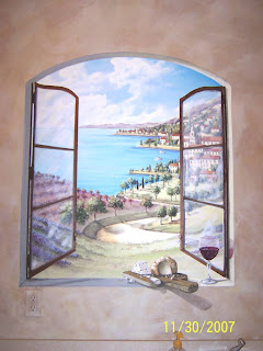
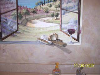
Okay, so you have the general idea of what size the painting will be, and a good handle on the particulars of the project; A window looking out over a Tuscan village. On the window sill you are going to add a wine glass (everyone has a glass of wine when doing laundry, right?), and maybe a wedge of cheese on a cutting board. Okay sounds whimsical, but mural art often is the perfect place to add whimsy to home decor. In any case, you now have the information from which to make a preliminary sketch or work-up. You find some photographs of Italy in a magazine or travel brochure (those are good hints for sources), you may even find a picture in StockPhotos online. You may need to get permission to use the photo but that's easy enough. Get out your old cutting board and buy a wedge of cheese from the grocery store. Rummage around and find that cool old cheese knife and set up a still life to work from.

WORK-UP (Preliminary Sketch)

The Work-up is crucial to creating a successful mural. I go to a hobby store or art supply store and purchase acid free poster board, or canvas board, somewhere in the neighborhood of 14 x 22 inches- thereabouts. I set up my work station, assemble my research and commence lightly penciling in the scene ideas. Once I get the general scene laid out I paint it. This helps immensely because once you have painted the project idea, though on a much smaller scale, you will find it much easier to paint again on the wall.

Finally, submit the work-up to your client for approval. You may find they want to add something or take out something, so it is a must they sign off on your idea.

THE MURAL
- Materials:

- Paint should be acrylics. Grumbacher makes top shelf acrylic paints. Long lasting material, vibrent colors - pricy. But I use a lot of Folk Art, Liquidex and even Apple Barrel acrylic paints. And for very large projects I will use latex paints you would typically use on your house. Oil paint, for mural purposes, takes much to long to dry and work with and the cost is prohibitive.

- Brushes should vary in size and texture to suit your own preference. Prices vary greatly on brushes. I like Blick brushes, Da Vinci and Robert Simmons, but really any brush on sale is a good brush. I lay in background colors with a 3 inch smooth nap roller and blend or feather it in with large (2 inch and often larger soft bristle brushes), and for these I like Purdy black bristle and natural bristle brushes for my sky and land areas.

- 3m Painter's Tape. I use the 3m "delicate surface" Painter's Tape on walls because it will not pull off the wall paint... usually. You will use this on the edges of your window scene so that when you pull it off, it will have a nice, crisp edge.

- Measuring tape to center your painting.

- 2 foot level for your straight lines around the window.

- Drop cloths. Plastic or plastic/paper or even canvas, they all work to keep the floors and counter tops free of spillage and splatter.

Establish the center of your wall, side to side and top to bottom then measure for the height width of the window and lay it in lightly with a pencil. I use Stabello, water soluble pencils. Next, place your tape around the marks for your window. Now start laying in some background color. DO NOT lay out the scene yet. Just fill in the background and foreground colors loosely and let them dry, it might take 5 minutes or less. I like to get my sky really detailed, and if I have water, (lake, ocean etc.), I do the same. It is much more difficult to detail the sky once you have trees and land intruding into the space.

Once you have the sky and foreground laid in you can start laying in the scenery details, villages, tress, roads - all the fun stuff.

When your scene is painted, you will finish by painting in the window, the window sill and finally adding in the wine glass, cheese wedge and knife and shadows.

You will find that unlike a small canvas painting, a mural requires ingenuity to make it look authentic. This is often referred to as "Trompe L'Oeil," a French term meaning. "to fool or trick the eye." The window (if it is painted to look as if it is open), as well as the sill, will need to follow rules that often do not comport with conventional vanishing point theories in two dimensional painting. Murals will be viewed from various vantage points, very seldom from one position. You will have to play with the vantage point and work out the trajection of your forced perspective. This is a lot fun, frustrating too, but approach it carefully and thoughtfully, it is the very essence of what makes mural art so cool. Too many times I see a mural with floors that look more like walls because the forced perspective was not carefully and properly considered. That is, the artist very likely failed to step back and consider the trajection (viewing point) and simply used their preliminary sketch as a template. Once height, space and vantage point take over all aspects of the design become subject to them. So step away from your mural frequently to be sure the mural follows the trajection that best makes it look authentic. I have found that I will have four or five lines of trajection on a single mural. Did I mention- Step away from the mural and look it over? Really, move to one side and the other, walk as far back as possible. Does it "appear" to your eye to be correct, architecturally speaking? If so, great. If not, re-paint it. Remember, it's just paint. It is easy to redo. But make it "appear" correct. That will give you the most satisfaction. You want to hear people walk up and say, "Oh wow, that looks amazing. I thought it was real at first."


I hope this little lesson was an encouragement to you and that you will try a mural and discover a wondrous art form.


The Mural Man